
 ✖
✖
Carbon budget calculations for the average country
An "average country" of the world is used here as an example of CO2 emission cuts that are needed in order to comply with the Paris Agreement and other aspirations to limit global warming to targets such as 1.5°C.
This article shows a series of carbon budget calculations.
In summary:
- At the current level of CO2 emissions, the global carbon budget that has a 50% chance of limiting global warming to 1.5°C runs out in 2033.
- Cutting emissions to zero in 2050 as a linear decline would considerably exceed the global carbon budget for 1.5°C. Instead, the decline to zero needs to be by 2043.
These conclusions apply only on average - developed countries promised in the Paris Agreement (Article 4) to cut emissions faster than the global average.
The average country
This is taken to have- a population equal to the world average country population of 40 million in 2021
- CO2 emissions in 2019 equal to the world average of 4.6 tonnes per person per year (this world average has changed little for several decades, unlike the world total which has increased steadily, as the world population has grown)
- emissions resulting from the production of imports equal to the emissions from the production of exports.
Options for limiting global warming to 1.5°C
The scientific consensus is that global warming can be limited to 1.5°C if emissions since the start of 2020 are limited to 500 billion tonnes CO2 (this is with 50% confidence). This works out as 63 tonnes per person. This is a lifetime limit.The average country has already used 23 tonnes of this per person budget in the 5 years to the end of 2024, leaving a residual budget from the start of 2025 of 40 tonnes CO2 per person.
The charts shown below have been generated by the calculator at carbonindependent.org/carbonbudgets.php, and they can be replicated there.
1: Constant emissions: not compliant
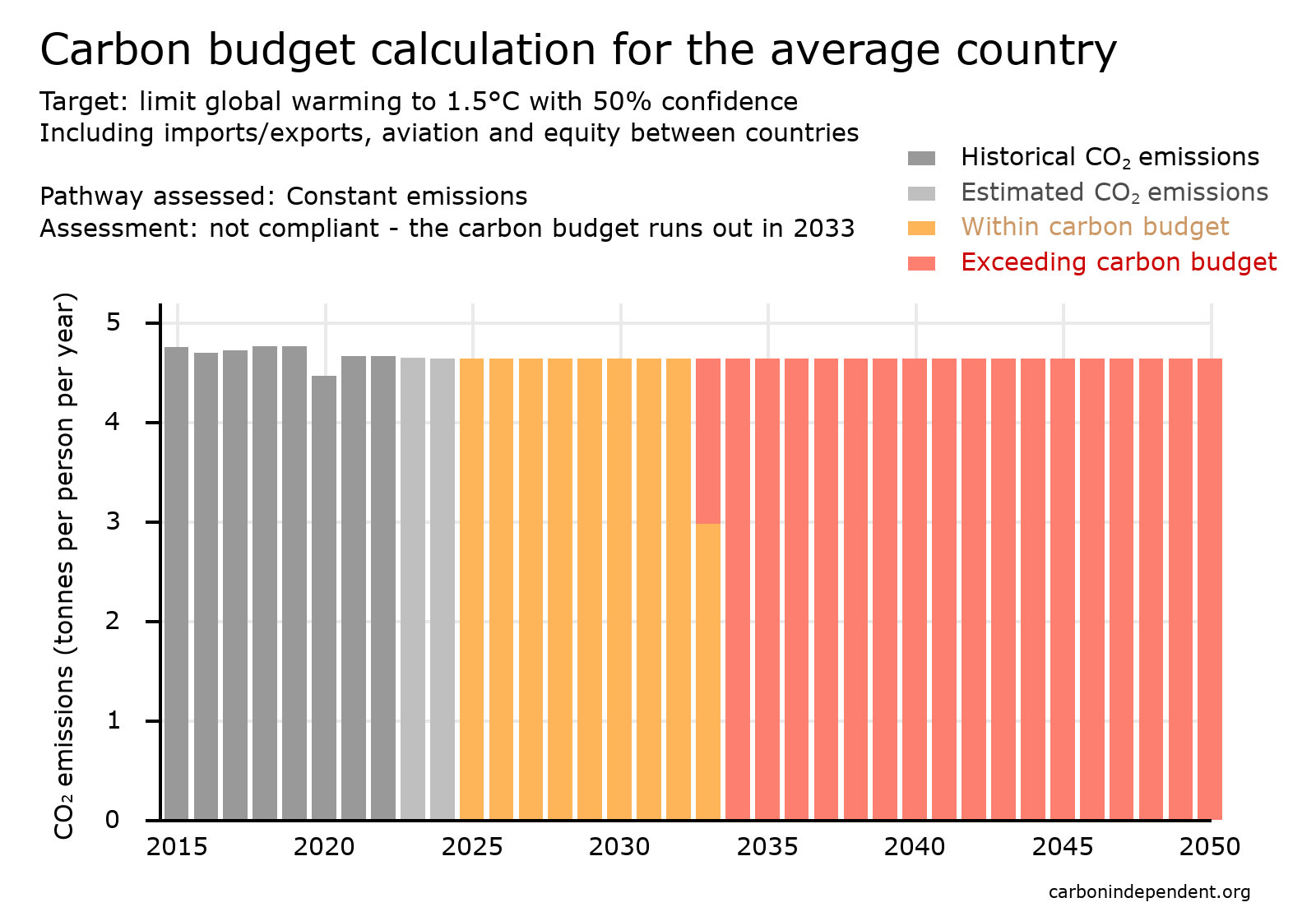 If emissions continue unchanged, this residual per person carbon budget will run out in 8.6 years from the start of 2025, i.e. in 2033, as illustrated in the chart.
Clearly, CO2 emissions need to be reduced.
2: Net Zero 2050 (linear decline): not compliant with the carbon budget
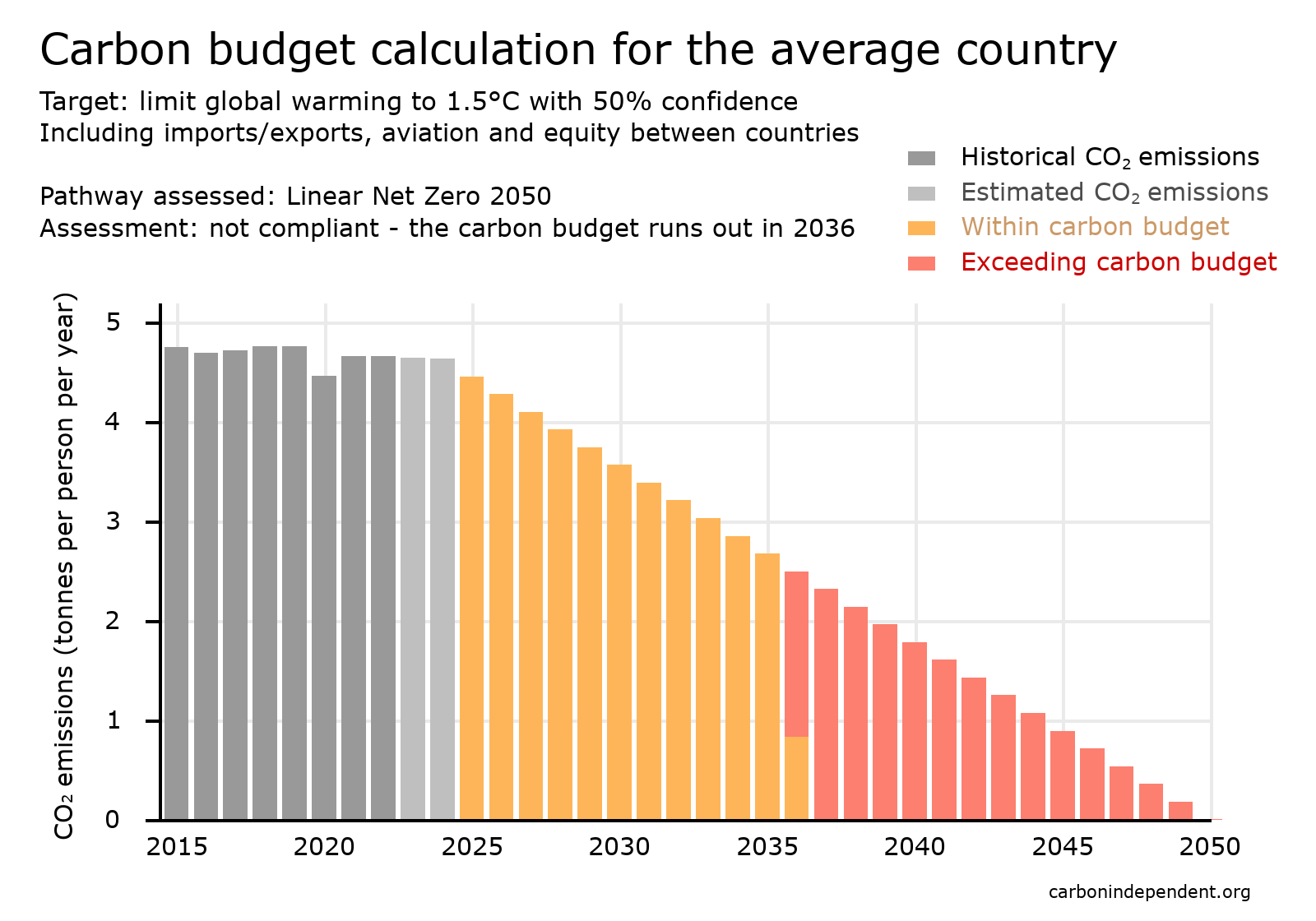 A pathway that is much talked about is "Net Zero 2050", where net CO2 emissions are reduced to zero in 2050. It is common for no details to be given of the pathway to net zero, and yet this is crucial since it is the cumulative emissions that matter, not the net zero date.
One version of net zero 2050 is to cut emissions steadily, by the same amount each year, which gives a sloping straight line on a chart of annual emissions. This can be termed "linear decline". It is easy to calculate that such a pathway of emissions would extend the carbon budget by 3 years to 2036, and so the pathway would not be compliant with the residual carbon budget. It would in fact emit 27% more CO2 than the carbon budget of 63 tonnes per person.
3: Net Zero 2040 (linear decline): compliant with the carbon budget
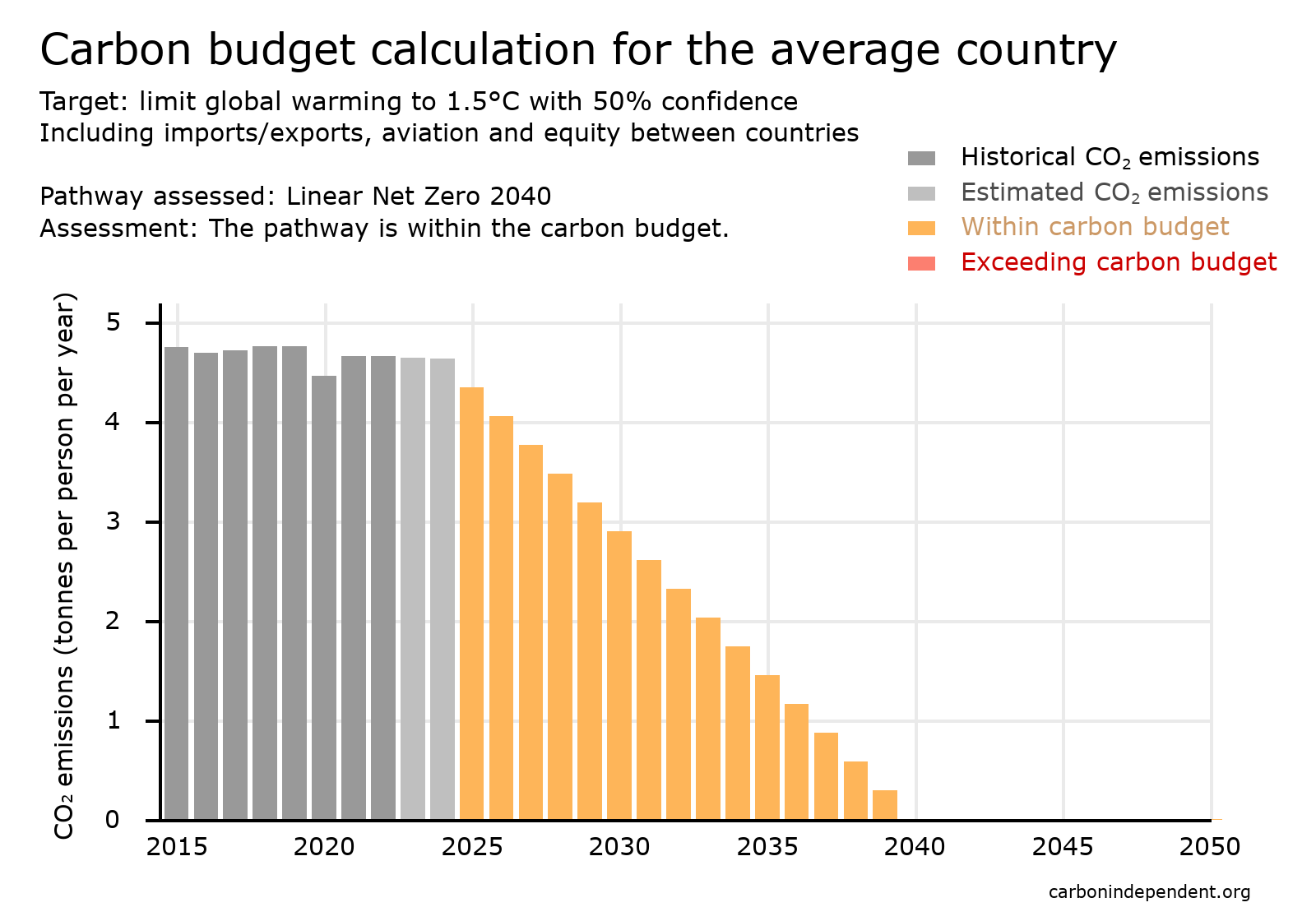 A pathway that reduces emissions faster than net zero 2050 is one that cuts emissions to zero in 2040 as a linear decline. This is just within the carbon budget of 63 tonnes per person - it would generate 58 tonnes CO2 per person.
4: Compliant exponential decline pathway
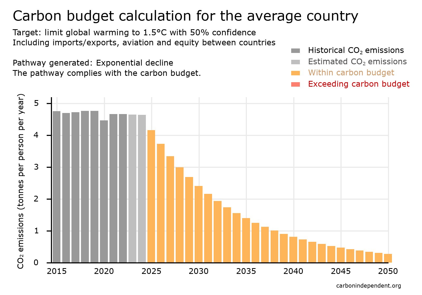 It seems unrealistic to expect emissions to suddenly stop - there are many applications of fossil fuels where a sustainable substitution is difficult. So it is worth considering a pathway where emissions tail off towards zero rather than suddenly stopping. One option is the exponential decline shown ('exponential' being used in the scientific sense of constant halving time). Emissions must fall at 10% per year.
5: Compliant smoothed exponential decline pathway
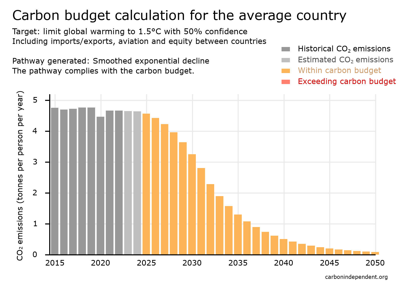 Also, it seems unrealistic for emissions to suddenly start falling rapidly, and a more gradual start to cuts would be preferable. The chart shows a more 'smoothed' or 'rounded' option, that is still consistent with the carbon budget.
Options for limiting global warming to temperatures higher than 1.5°C
6: Compliant smoothed exponential decline - 1.6°C
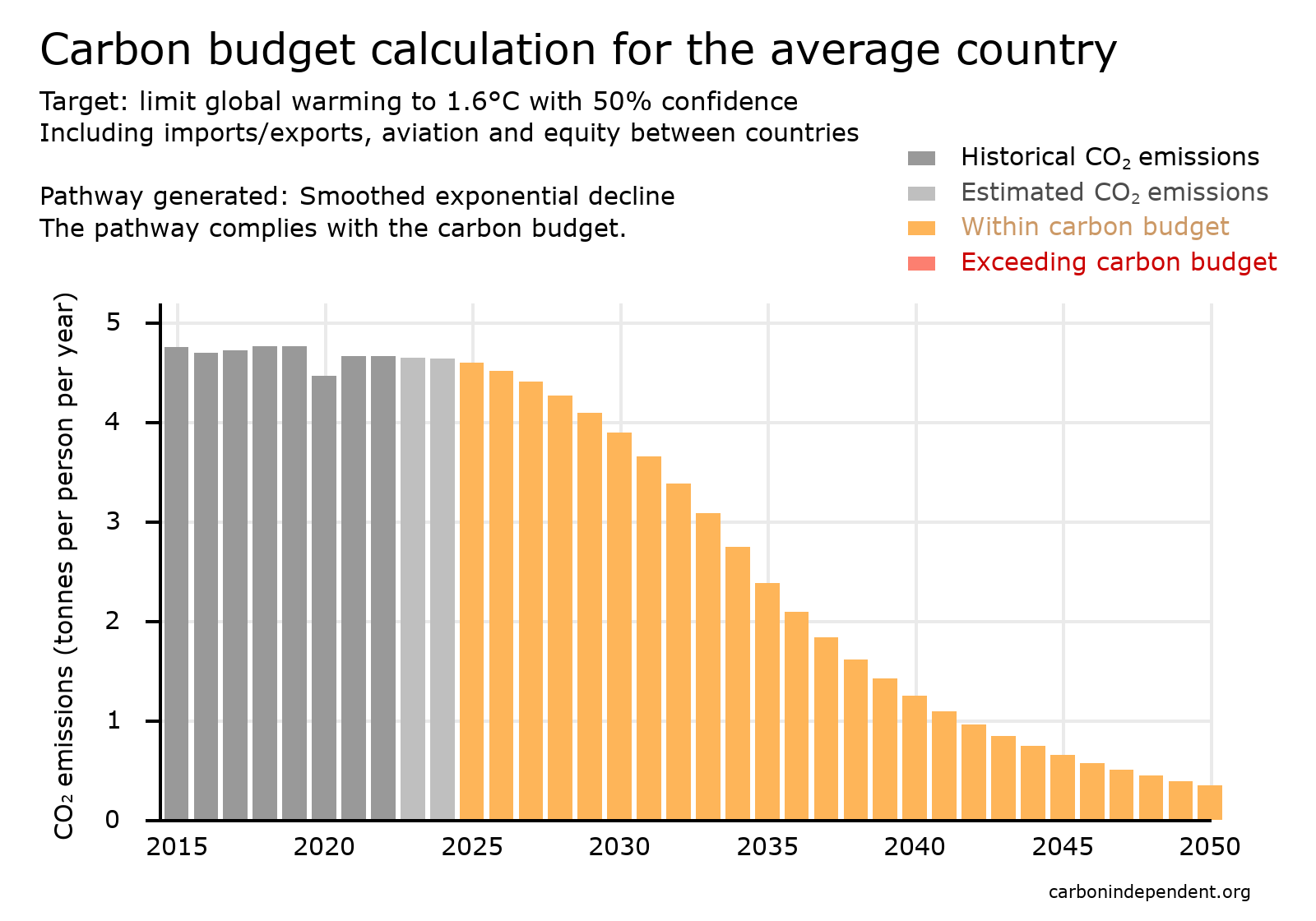 If a higher limit is accepted, the global carbon budget is greater, and so is the budget for the average country. But the consequences in terms of climate related deaths, human displacement and biodiversity loss are also greater. Many people consider these additional consequences to be unacceptable.
Showing renewable energy
7: Showing renewable energy with linear extrapolation
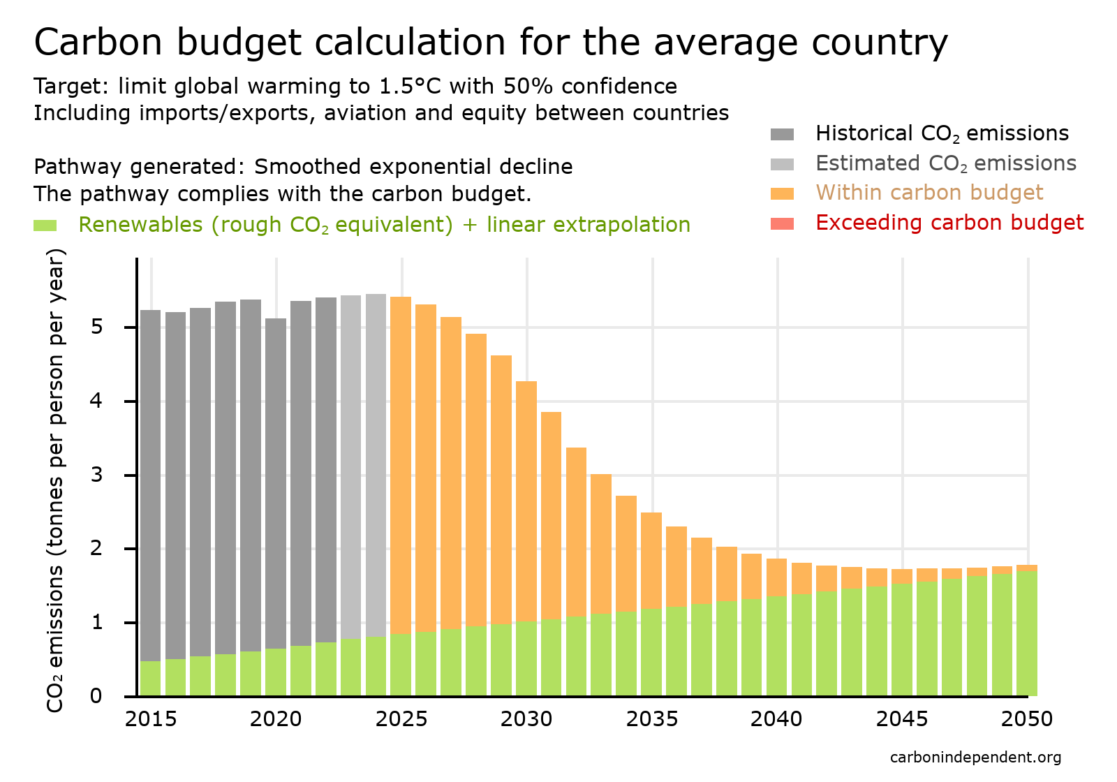 Globally, about 14% of primary energy consumption is from renewable sources.
 This can be shown on a carbon budget chart via the amount of CO2 that would have been emitted if the energy had been produced from fossil fuels.
One possible scenario is that energy from renewable sources continues to increase at the same rate as it has done over recent years. This is termed a linear increase, and is shown on the chart.
8: Showing renewable energy with exponential extrapolation
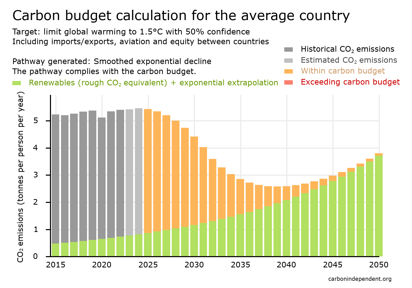 A second possible scenario is that energy from renewable sources continues to increase at the same annual percentage increase as it has done over recent years. This is termed an exponential increase, and is shown on the chart.
 Latest research
An international group of leading climate scientists have recently updated their estimates for the remaining global carbon budget available before the 1.5°C and other temperature targets are breached [1]. These new estimates do not change the conclusions of the analysis above, except that they indicate that action is even more urgent.Sources
| [1] | Indicators of Global Climate Change 2024: annual update of key indicators of the state of the climate system and human influence (2025) https://essd.copernicus.org/articles/17/2641/2025/ |
For other sources and further explanations, see UK carbon budget calculations 2025 (document 177).
First published: 22 Dec 2023